A Cause to Catch Fire.
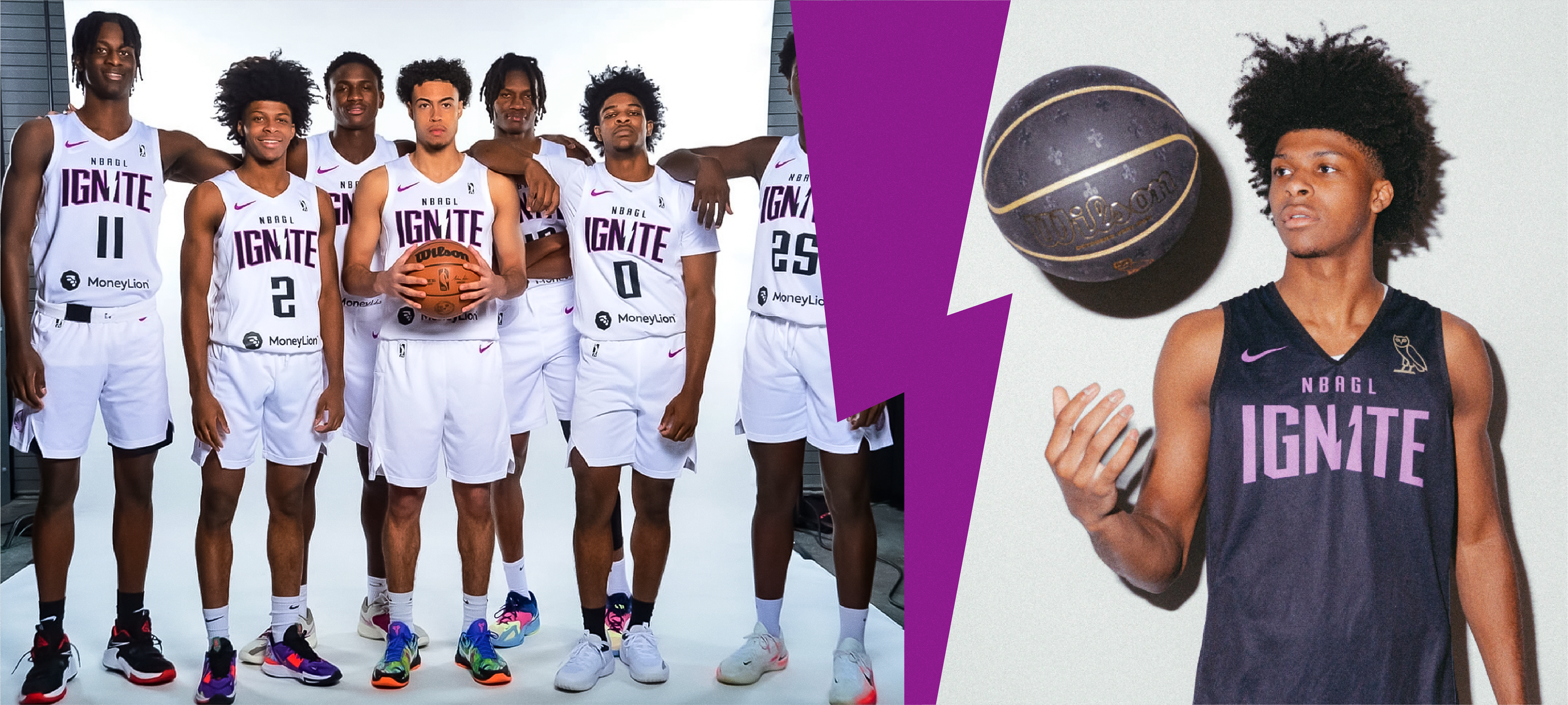
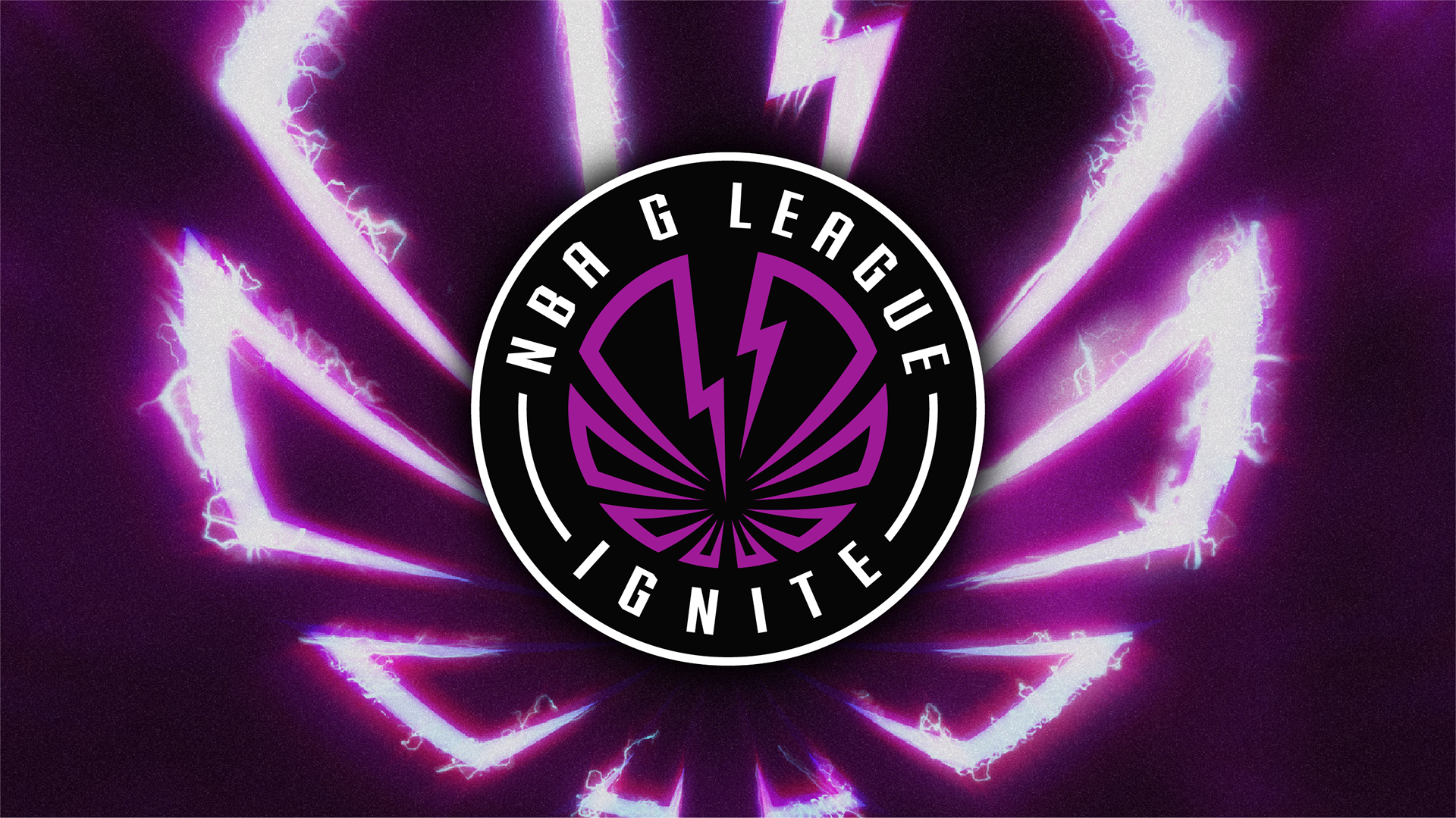
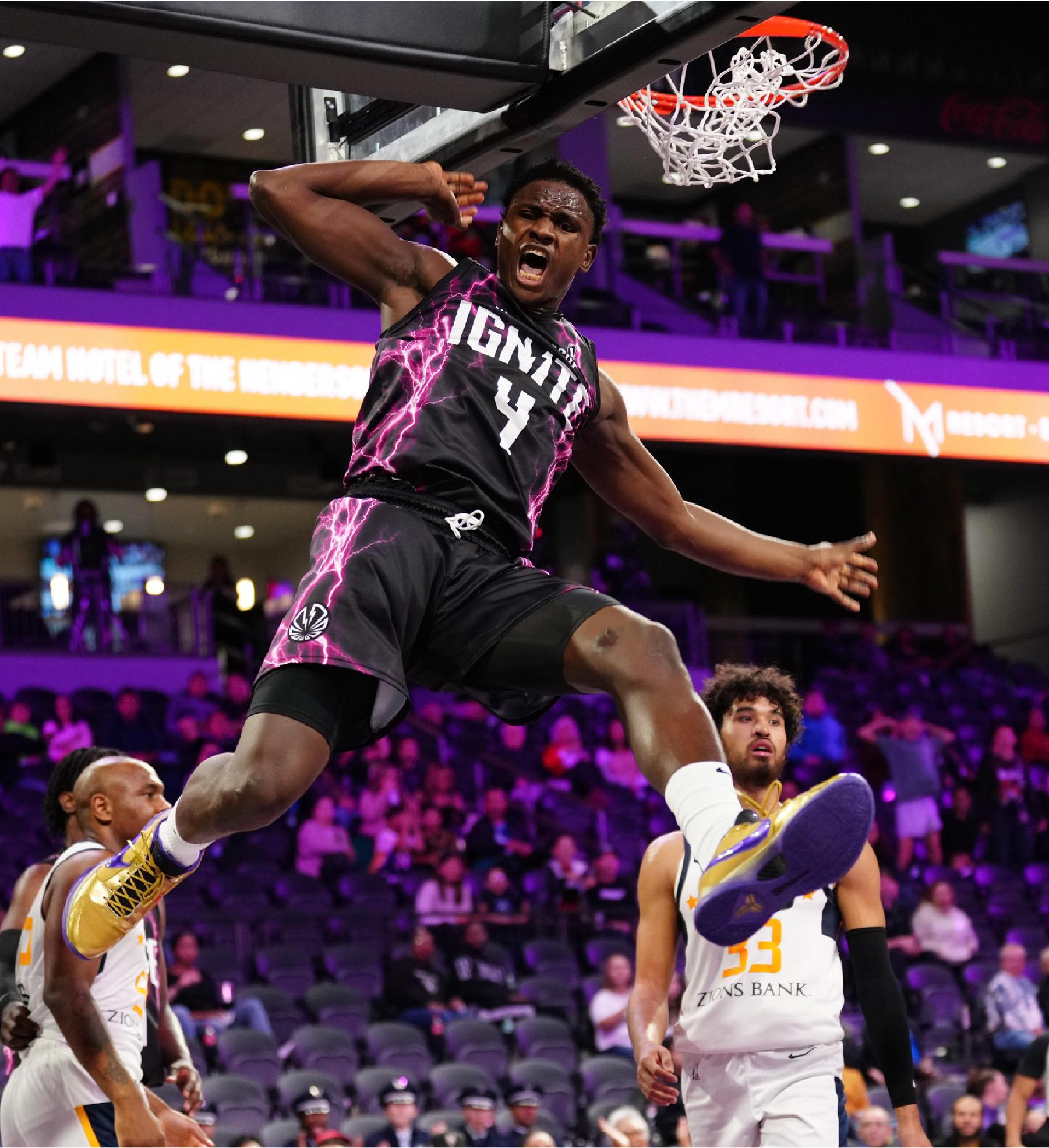
Nike The NBA G League Ignite is a developmental basketball team in the NBA G League Based in Henderson, Nevada. The team was designed to play exhibition games outside the G League's traditional scheduling as part of a one-year development program for elite National Basketball Association (NBA) prospects. Its roster is made up of both prospects and veteran players.
Nike The NBA G League Ignite is a developmental basketball team in the NBA G League Based in Henderson, Nevada. The team was designed to play exhibition games outside the G League's traditional scheduling as part of a one-year development program for elite National Basketball Association (NBA) prospects. Its roster is made up of both prospects and veteran players.
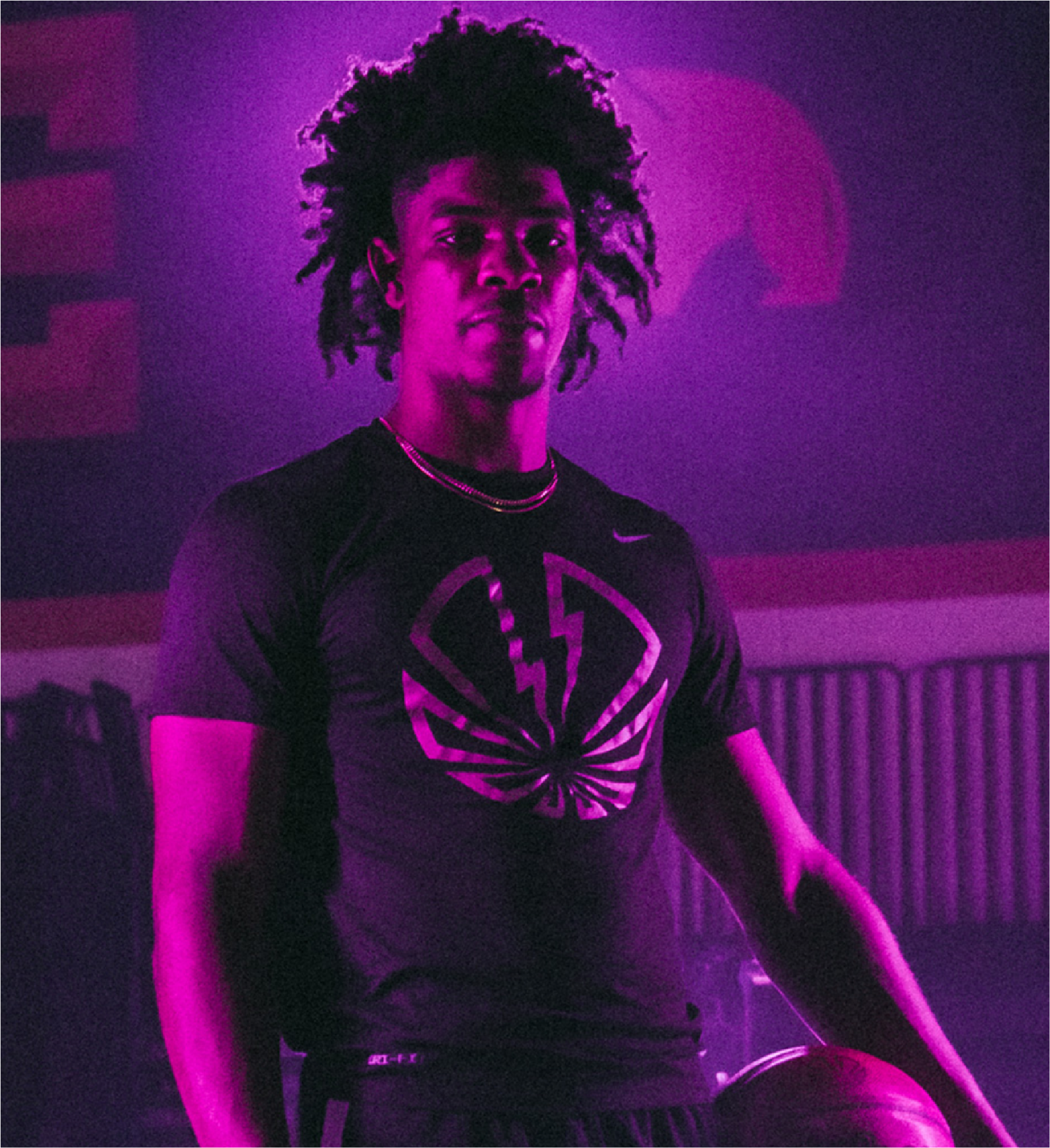
The Ignite team came to Rare Design in 2021 for an updated identity that could accurately capture the fire in the hearts of the players and fans of the team. They were really looking for an identity that could tell the story of what the G League stands for, while also expressing the explosiveness of the players that the team generates.
The RARE Design Team
Rodney Richardson - Principal/CD
Marie Siegfried - Account Director
Jason Wright - Account Manager/Copywriter
Ethan Manning - Designer
Cody Bass - Designer
Brian Bollig - Designer
Ben Barnes - Designer
Services Provided:
Marie Siegfried - Account Director
Jason Wright - Account Manager/Copywriter
Ethan Manning - Designer
Cody Bass - Designer
Brian Bollig - Designer
Ben Barnes - Designer
Services Provided:
Identity Design
Typgraphic System Design
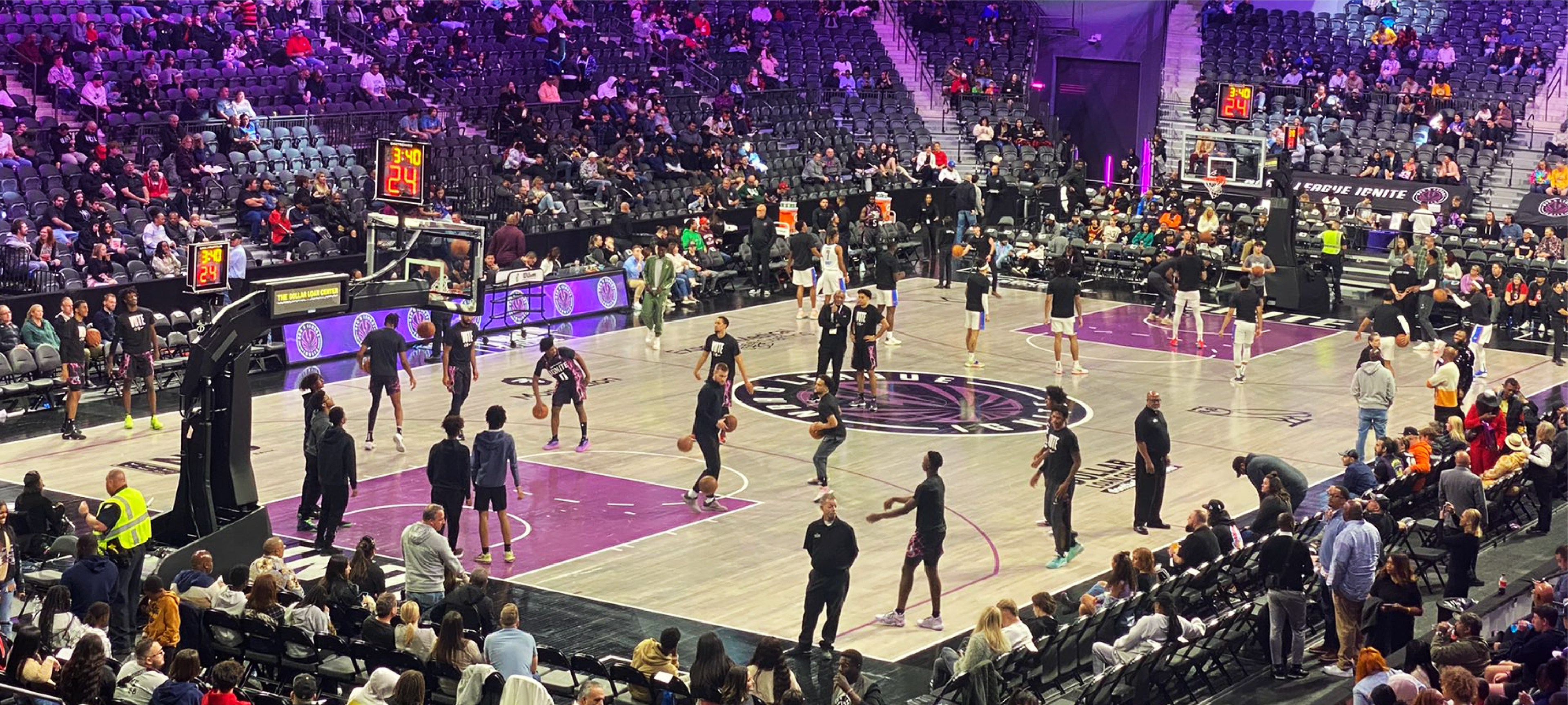
Court Design / Environmental Design
Social Media Design
Brand Guidelines
Typgraphic System Design
Court Design / Environmental Design
Social Media Design
Brand Guidelines
It All Starts With a Spark.
Before we started sketching and ideating for the Ignite icon and wordmarks, the Rare Design team focused on developing solid positioning to create against:
Before we started sketching and ideating for the Ignite icon and wordmarks, the Rare Design team focused on developing solid positioning to create against:
We are the cause. The catalyst. The essence which causes. But we are also the causing. The striking. The action which forms. And finally, we are the cause. The outcome. The team of unlimited potential. Together, we create something new, powerful, and energetic. Together, we IGNITE.
Once we had this positioning in a solid place, we were free to create and design within those words. This is where the true magic happens in the process. After several rounds of design - Rare and the Ignite Team landed on a system that they felt could make the strongest impact in the league.
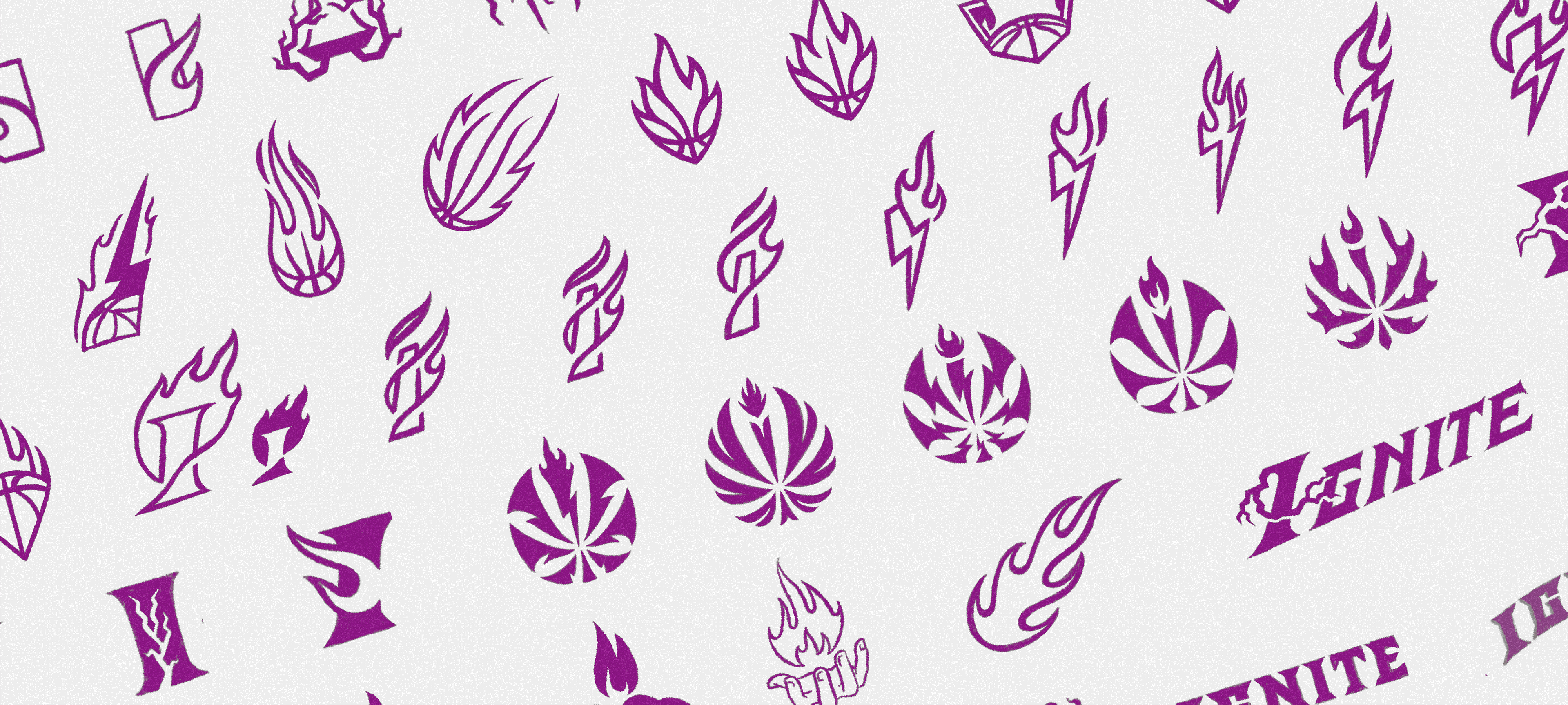
Early Exploration Sketches for the NBA G League Ignite Identity System
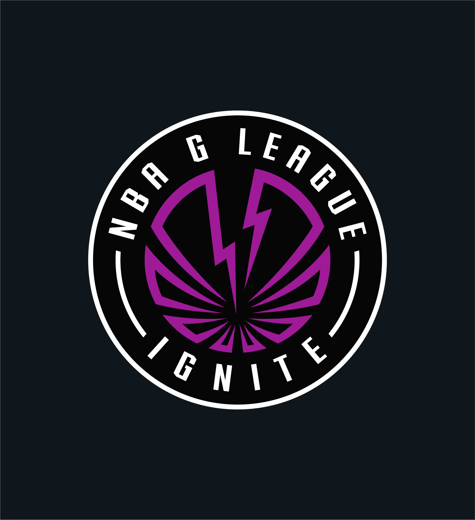
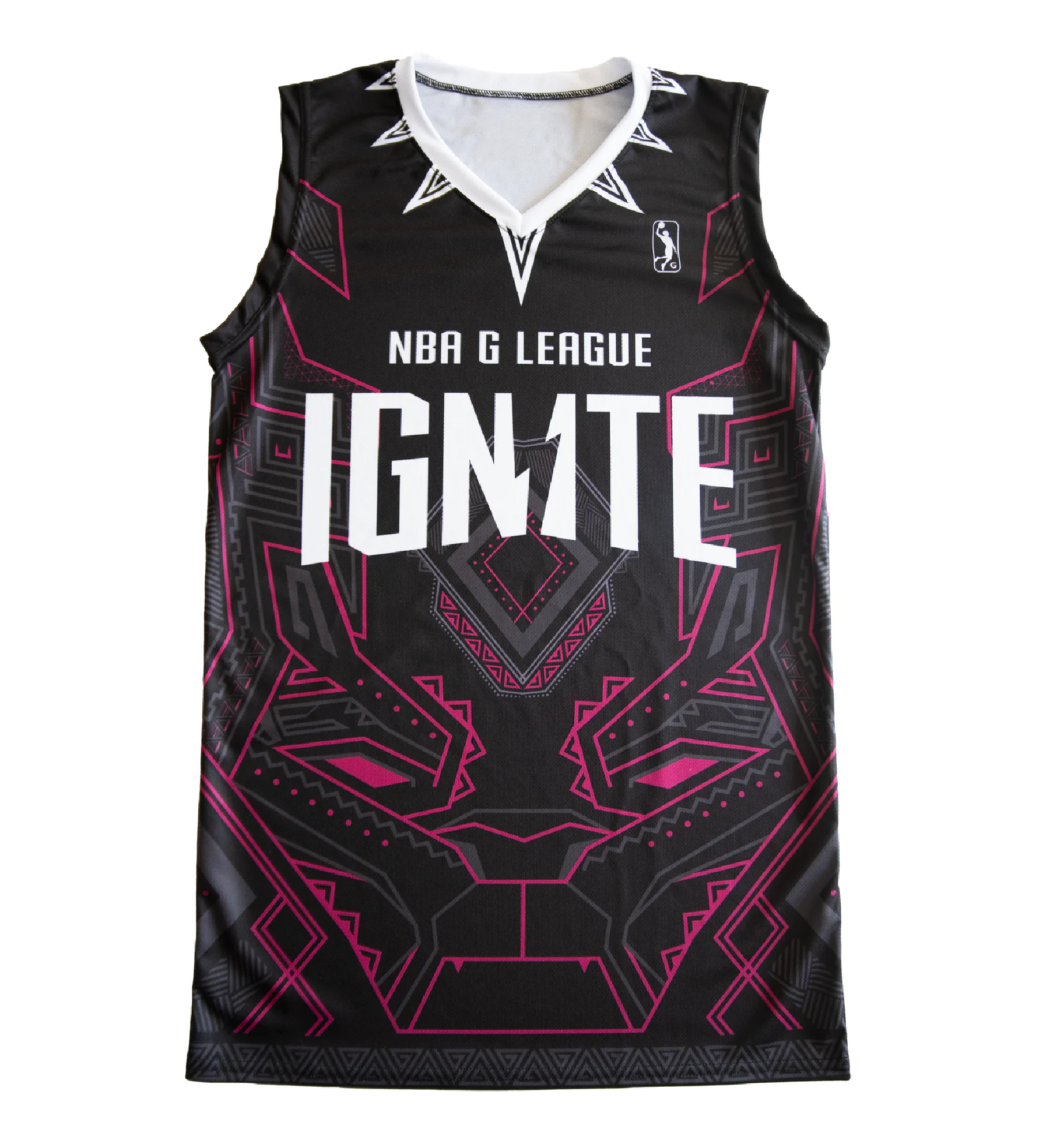
The Chosen NBA G League Ignite Primary and Word Marks.
A Bold Ignition.
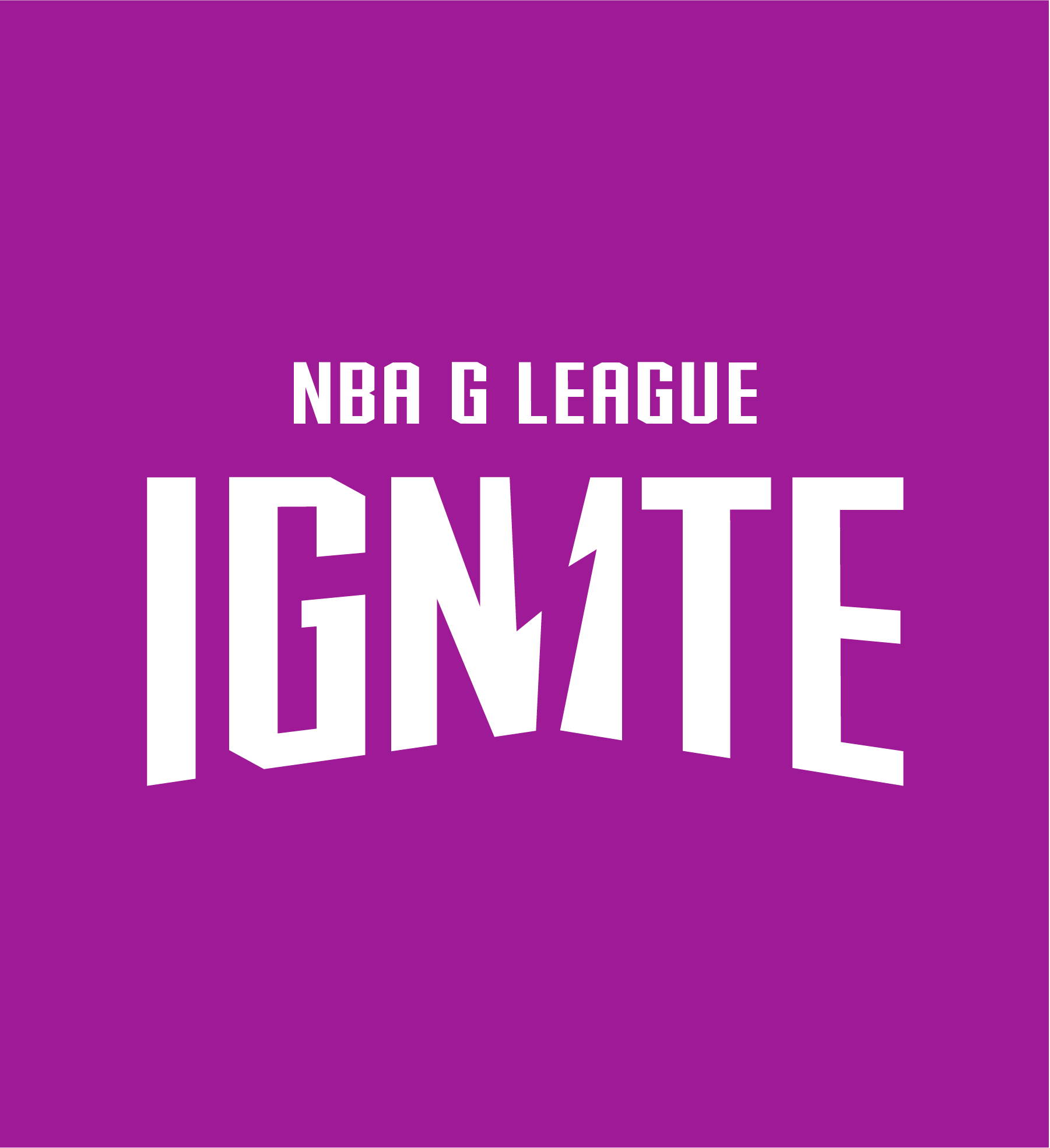
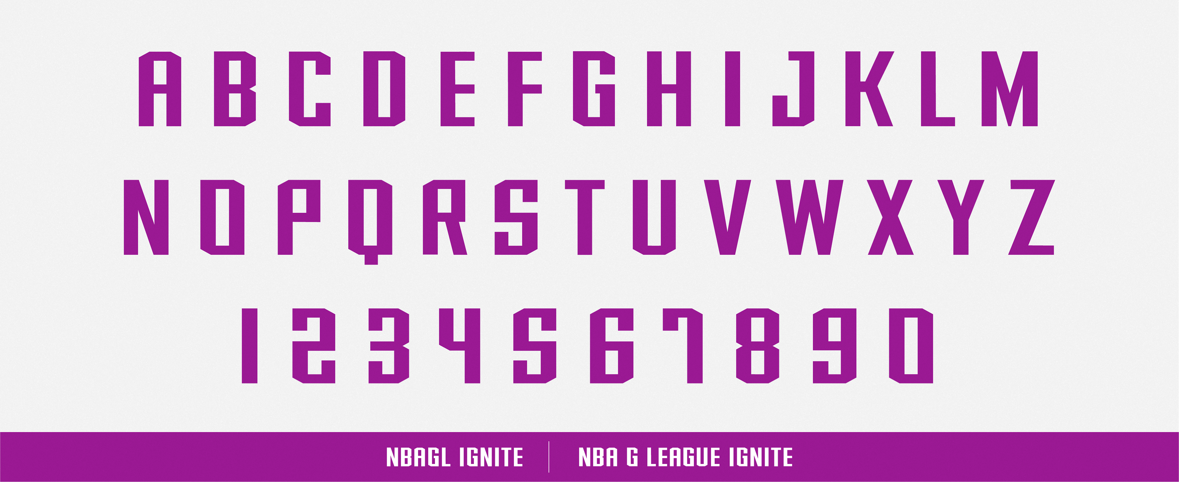
I was tasked in developing the block-letter system that would be used in the final Primary mark for Ignite, as well as the numbering on jerseys. The Ignite team wanted an alphabet that was a bit more geometric that could contrast well against the organic shapes and curves of the Global Icon. We decided to title it, Ignite Bold.
I was tasked in developing the block-letter system that would be used in the final Primary mark for Ignite, as well as the numbering on jerseys. The Ignite team wanted an alphabet that was a bit more geometric that could contrast well against the organic shapes and curves of the Global Icon. We decided to title it, Ignite Bold.