
A New Way Forward.
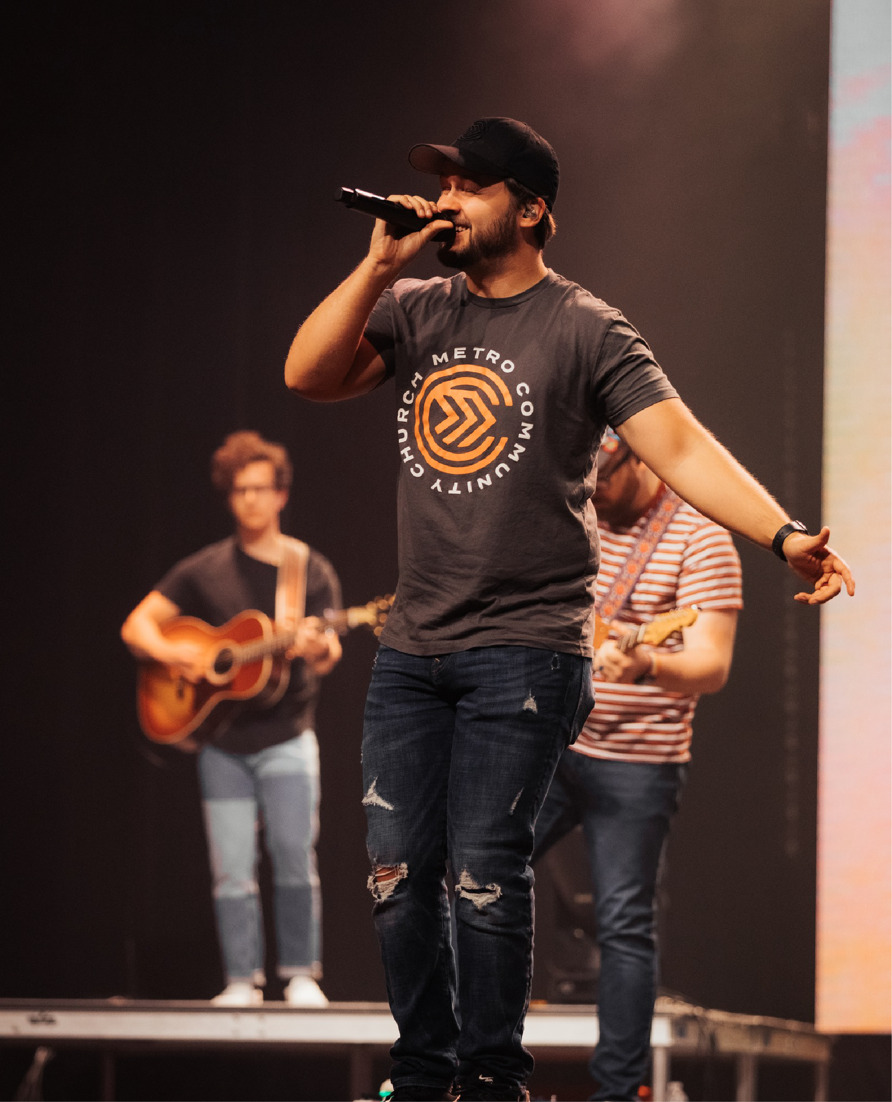
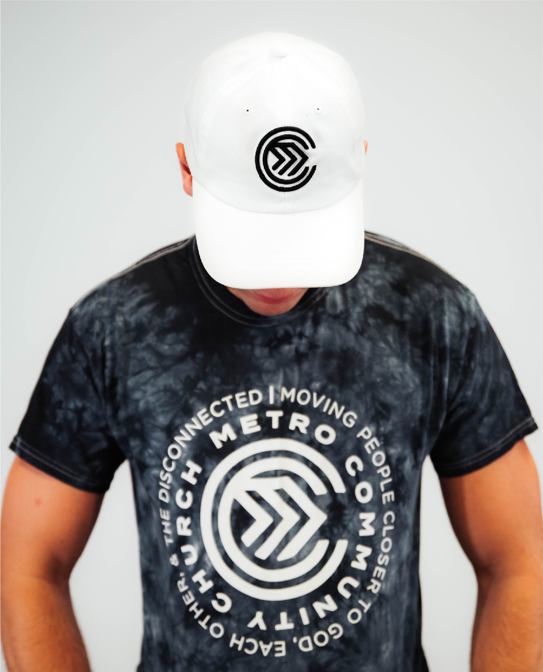
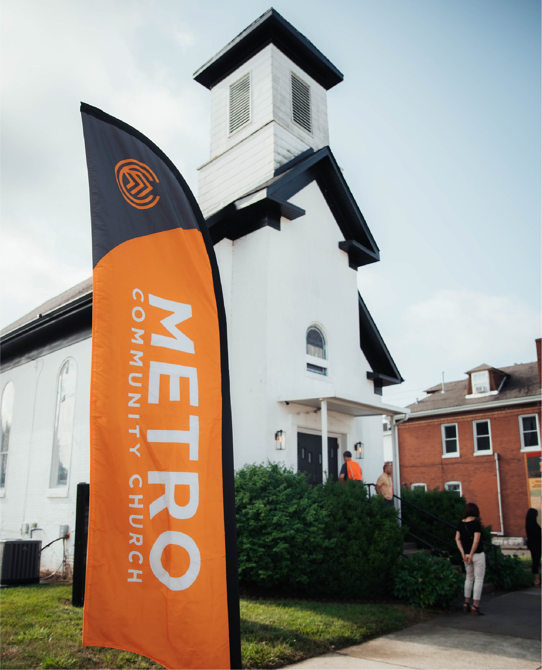
In 2018 I was approached by the staff at Metro Community Church in Edwardsville, Illinois to help them develop a new brand identity and visual language for the church. The goal was to create an identity for the church that would stand the test of time while conveying a sense of forward motion and progression. The two concentric circles that form the two "C's" in the icon form around the forward arrow ("M") to emphasize that, while the world changes around us, the mission of The Church stays the same.
Not only was I responsible solely for developing the updated identity system for Metro to implement - I was also asked to develop a brand guide for the church to use for future designers to take and help bring the brand to life as time goes on. I also was asked to unify the ministry areas of the church in tandem with the new identity system. I decided to bring the Kids, Students, College and Groups ministry areas together with the updated typography system.
Services Provided:
Identity Design
Brand Design
Brand Strategy
Brand Guidelines
Identity System Design
Brand Design
Brand Strategy
Brand Guidelines
Identity System Design


Early Exploration Sketches for the Metro Community Church Primary Identity
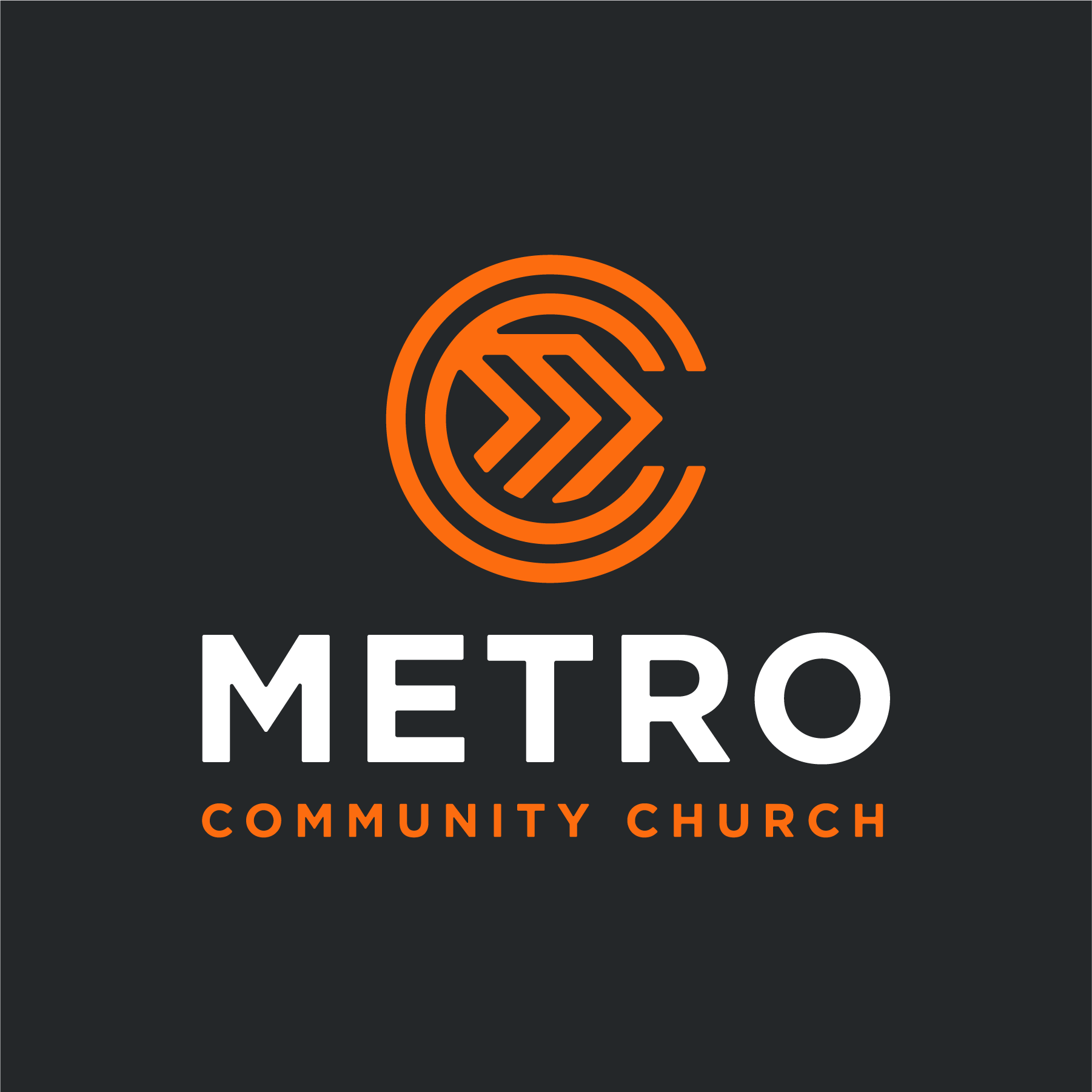
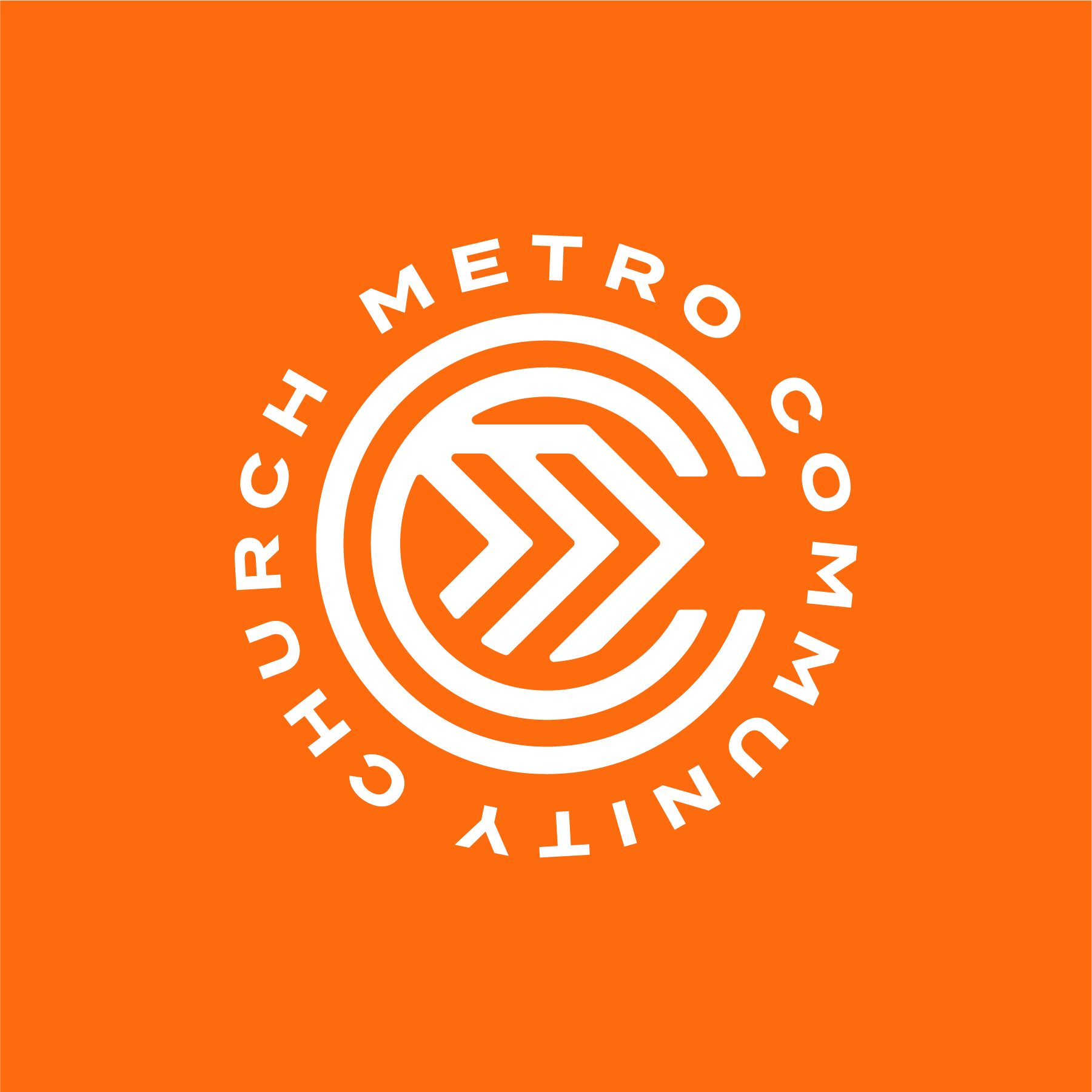

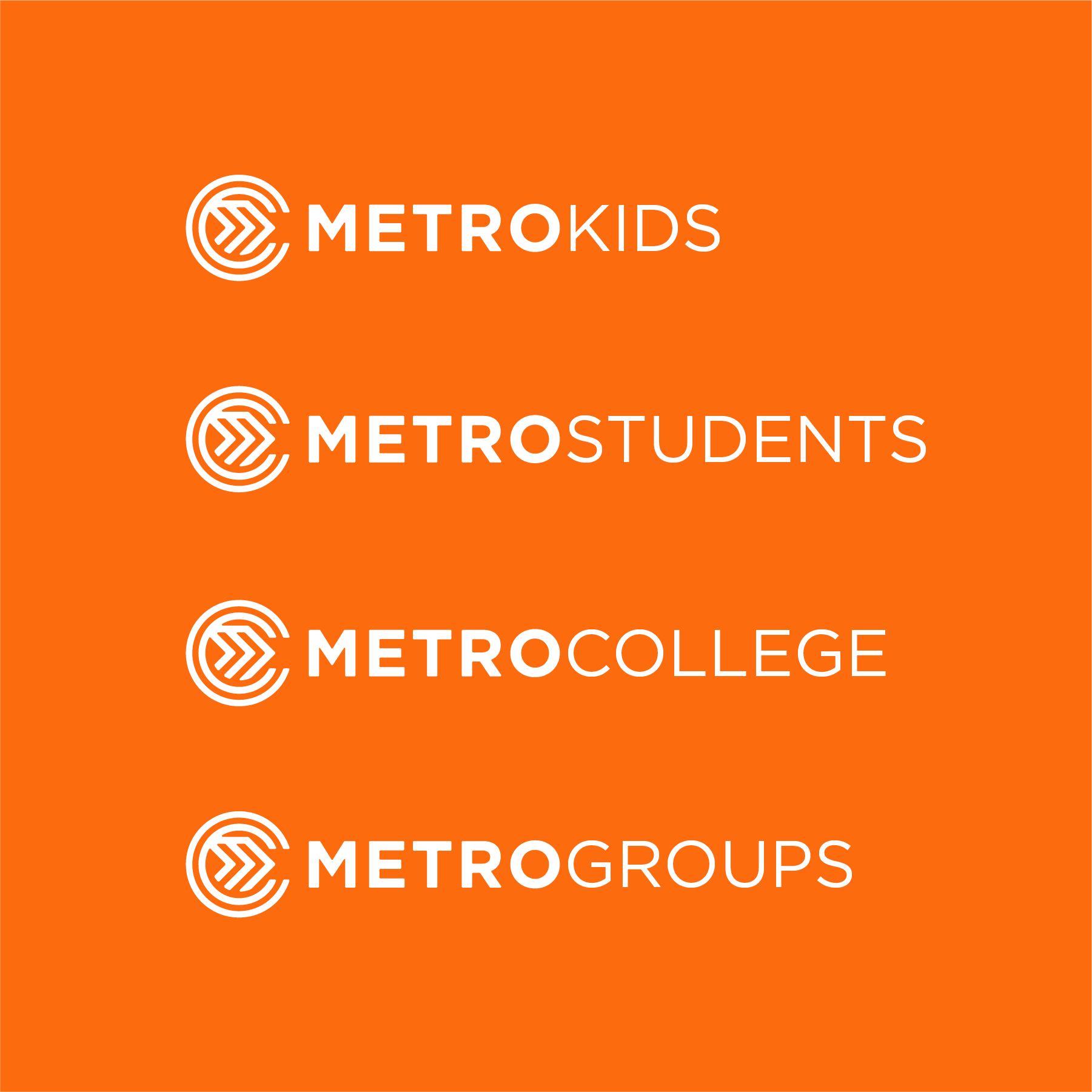
The Final Chosen Identity System for Metro Community Church | Identity System For the Different Ministry Areas in the Church

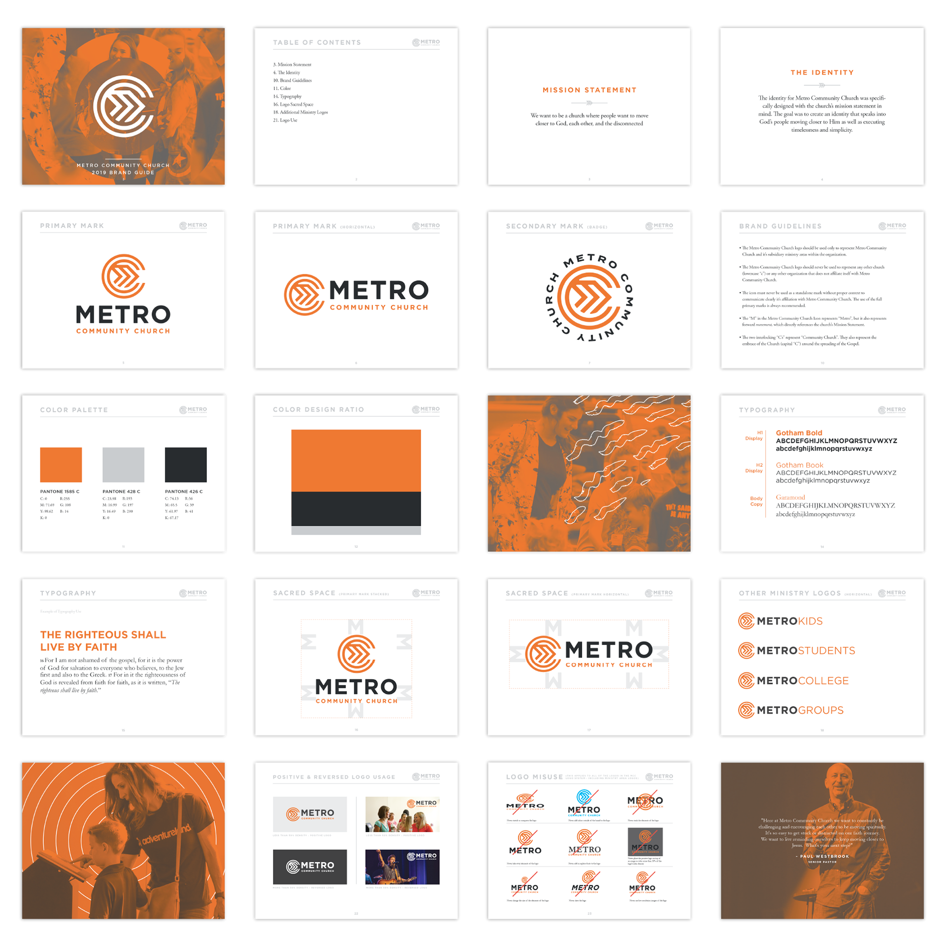
Brand Guidelines Designed for Metro Community Church