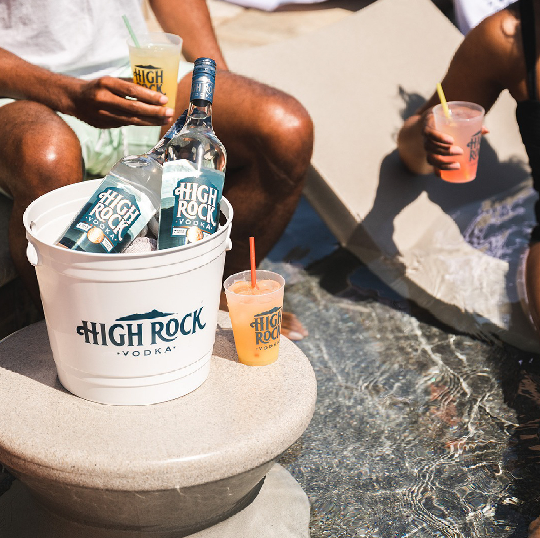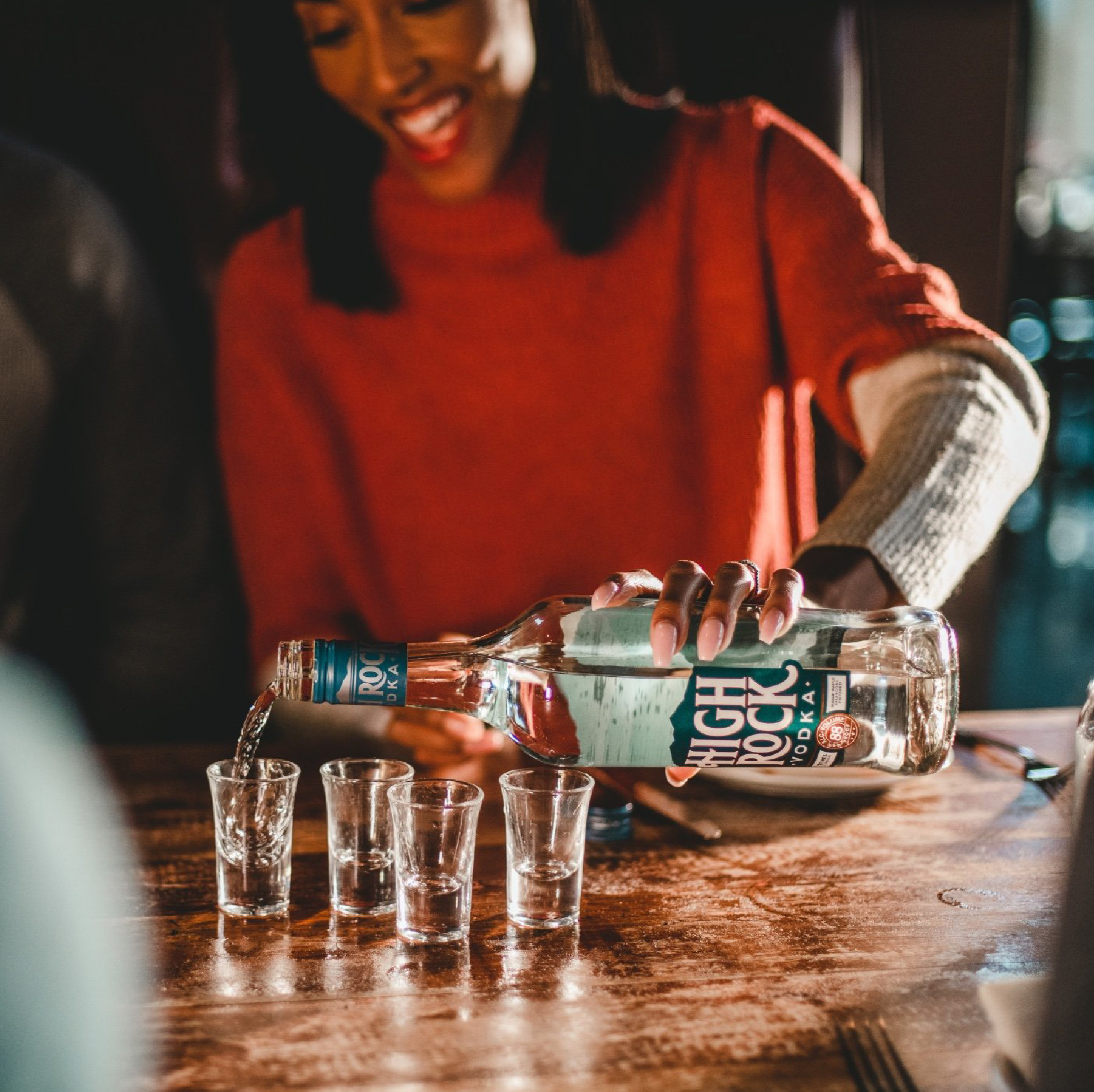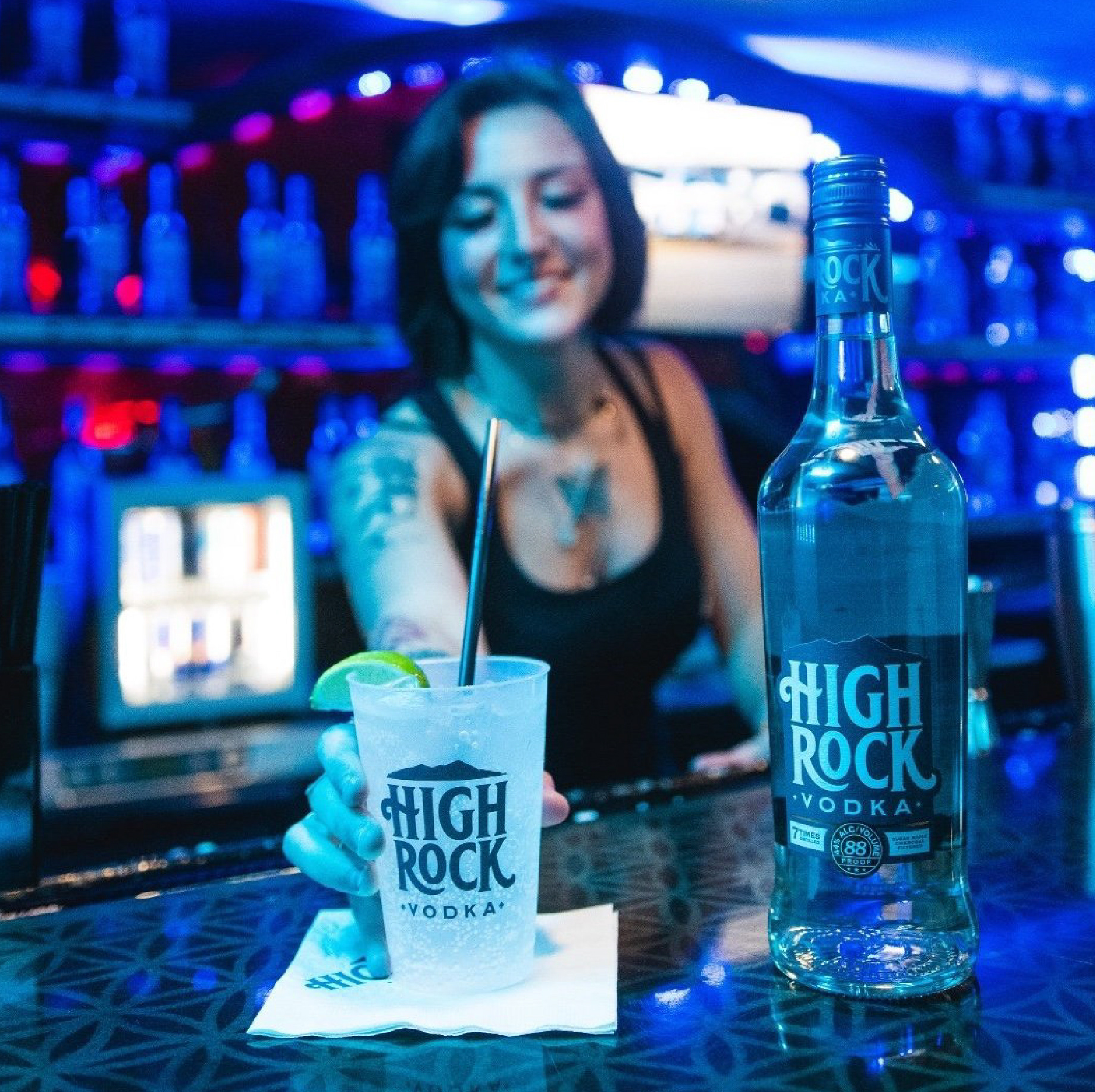
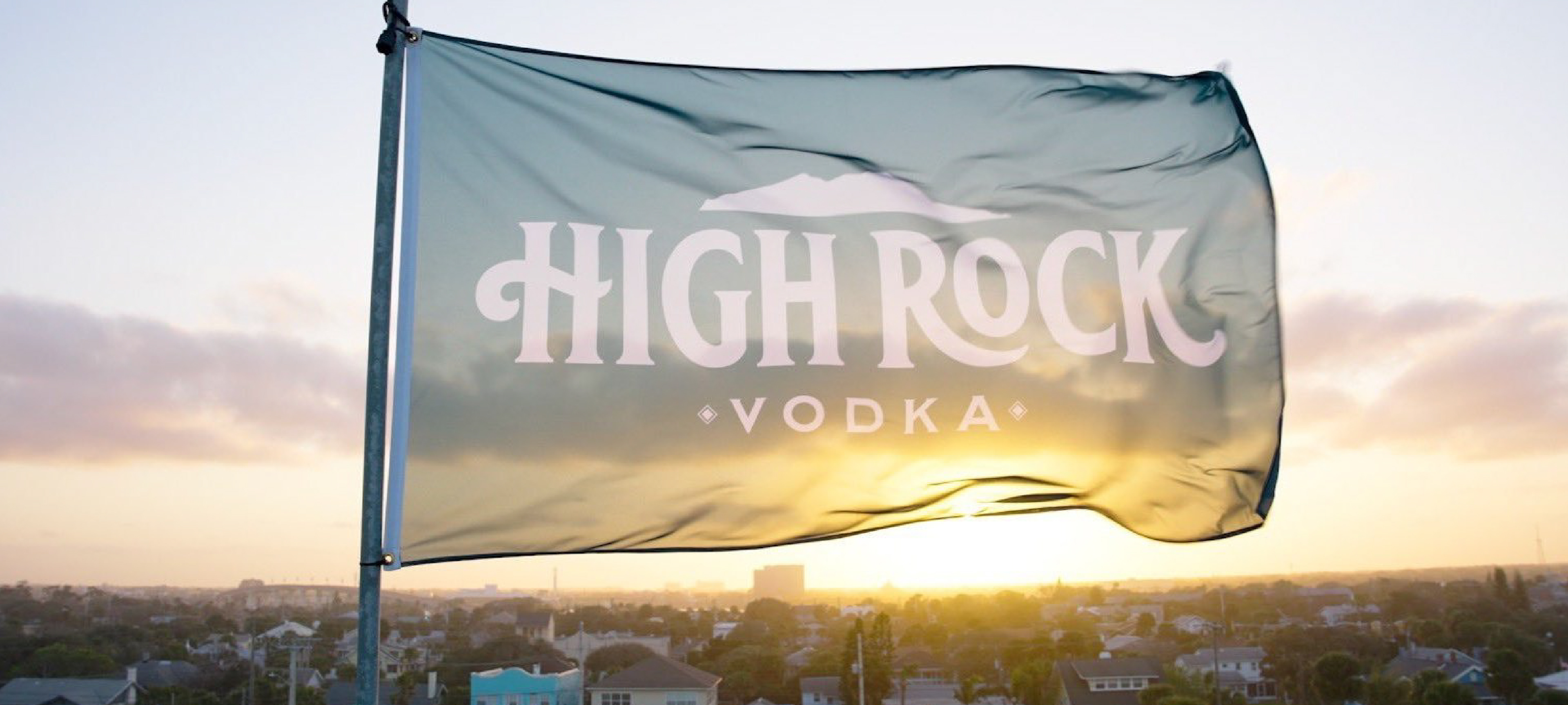
Reach For Your High Rock.
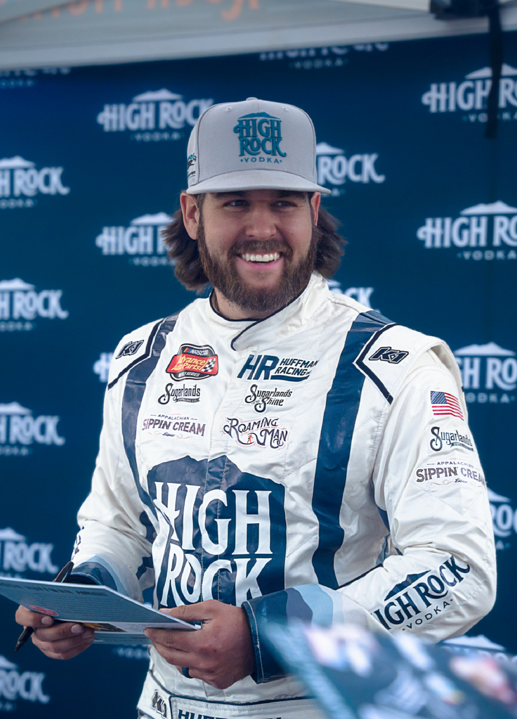
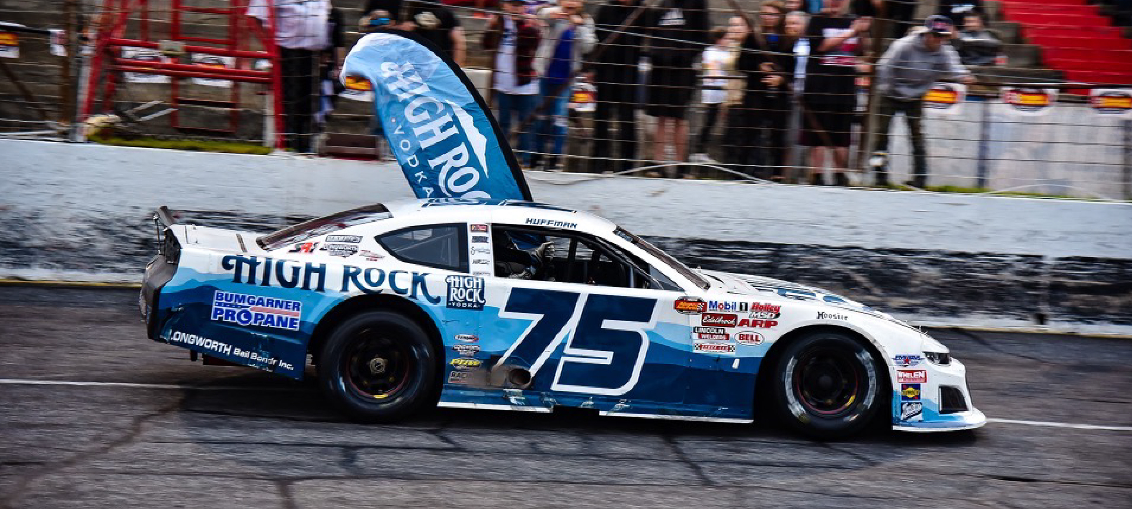
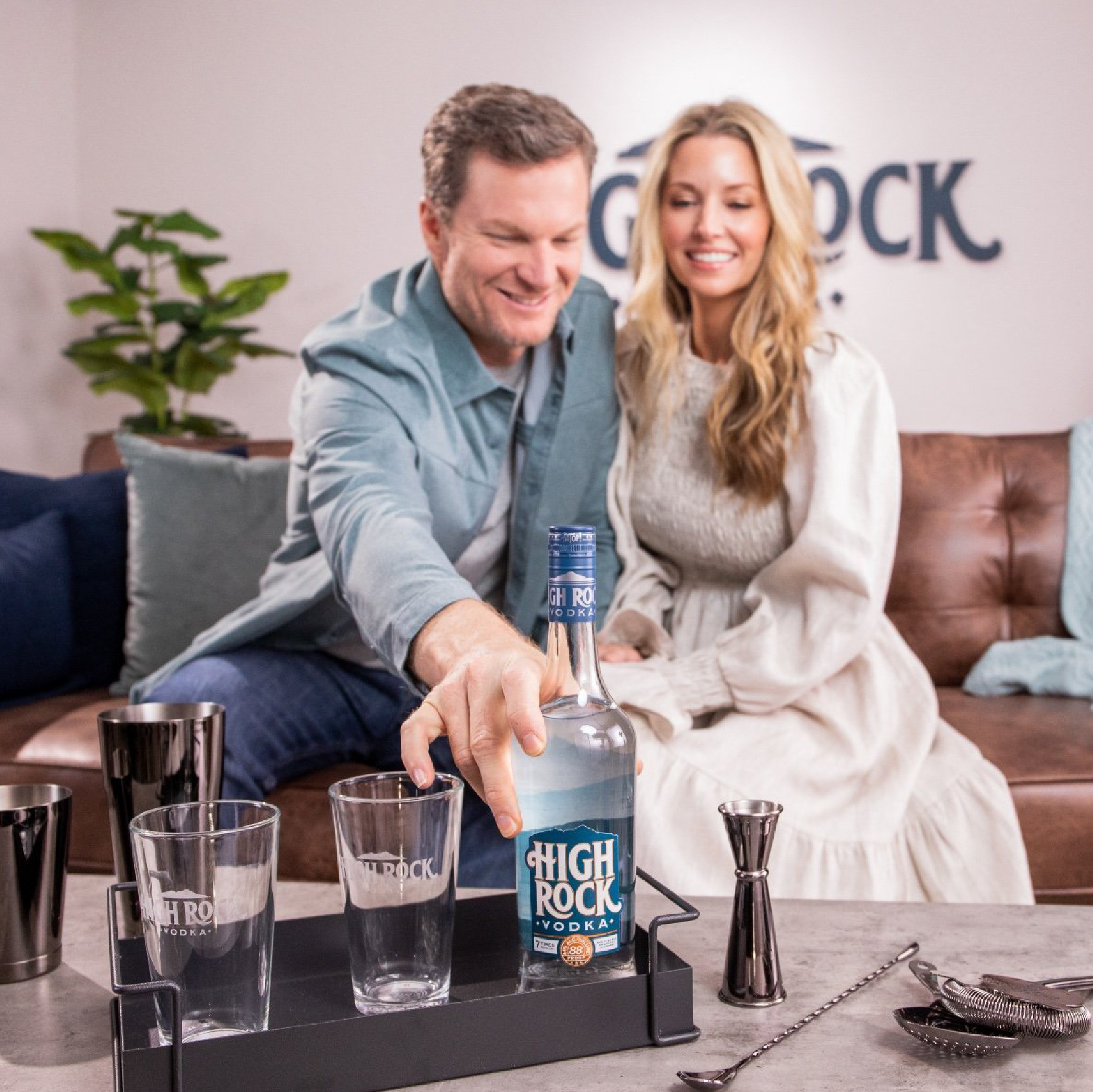
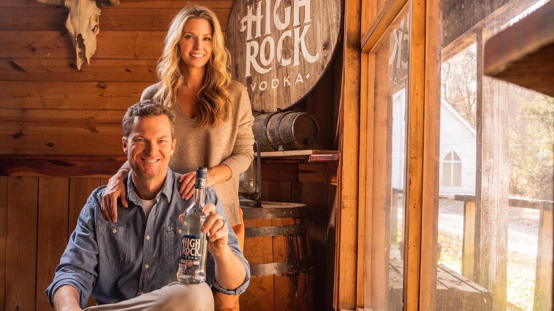
Dale Earnhardt Jr. has his own center of gravity when he enters a room. The dude is larger than life. His accolades as an accomplished NASCAR driver and team owner speak for themselves. He prides himself in going all-in on any project he lays his hands on - and it shows. He cares deeply about the sport and craft of racing, and he also cares deeply about his wife Amy. Together, with the help from Rare Design and Sugarlands Distilling in Gatlinburg, TN - they have crafted a vodka that stands out above the rest. High Rock Vodka is a sugar-maple charcoal filtered spirit that has the sweetness of the Smokies in every drop.
Dale Earnhardt Jr. has his own center of gravity when he enters a room. The dude is larger than life. His accolades as an accomplished NASCAR driver and team owner speak for themselves. He prides himself in going all-in on any project he lays his hands on - and it shows. He cares deeply about the sport and craft of racing, and he also cares deeply about his wife Amy. Together, with the help from Rare Design and Sugarlands Distilling in Gatlinburg, TN - they have crafted a vodka that stands out above the rest. High Rock Vodka is a sugar-maple charcoal filtered spirit that has the sweetness of the Smokies in every drop.
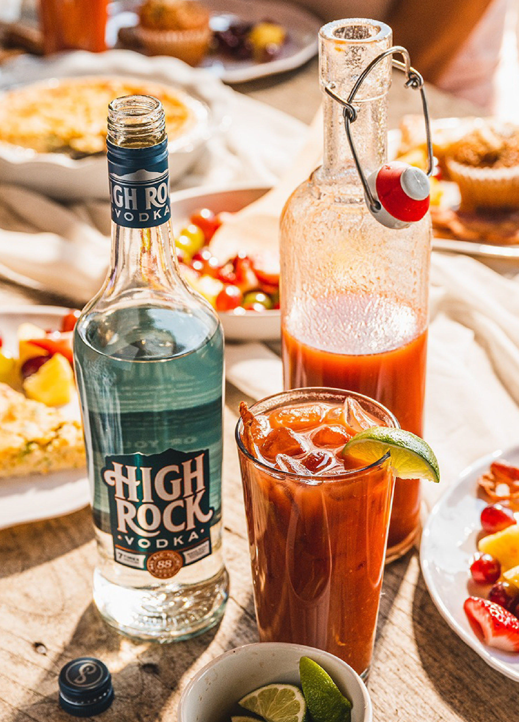
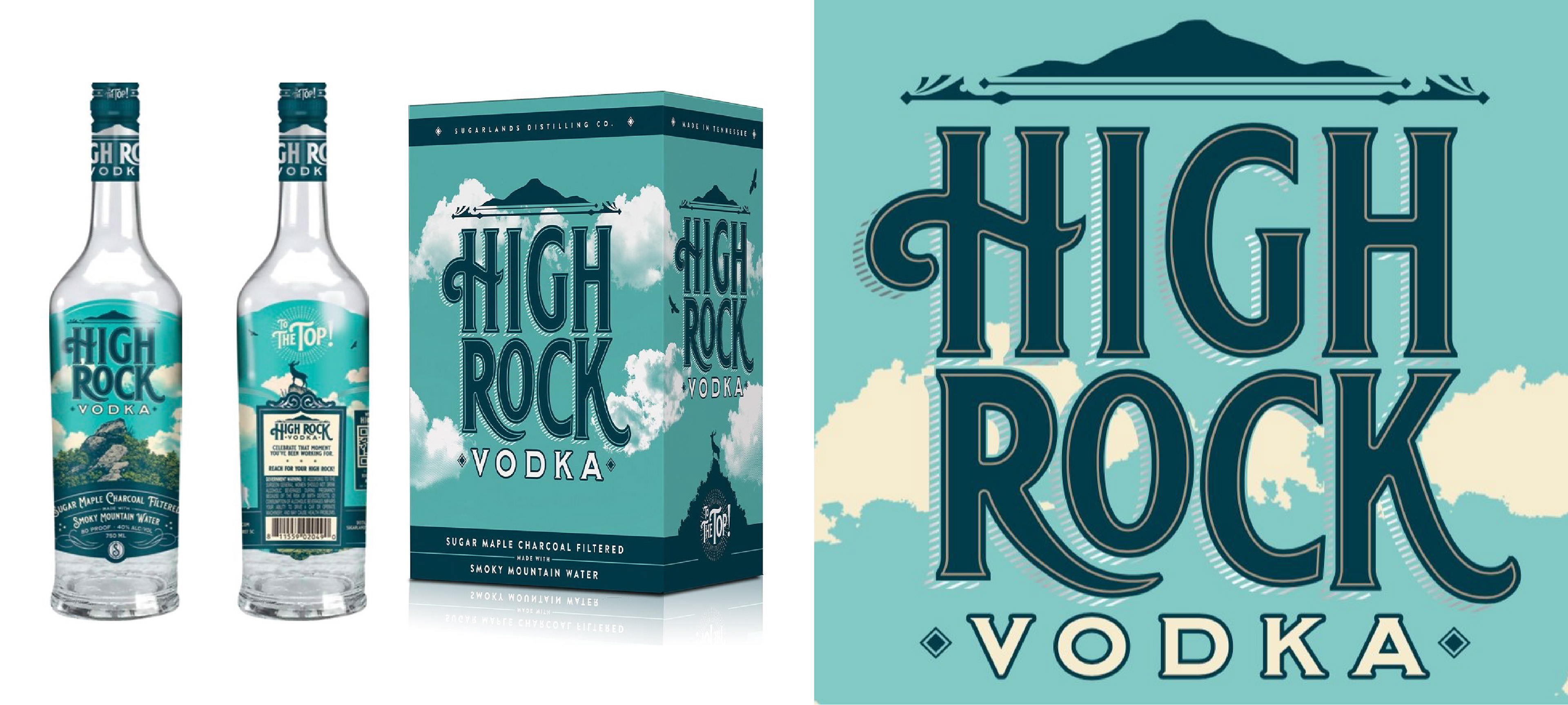
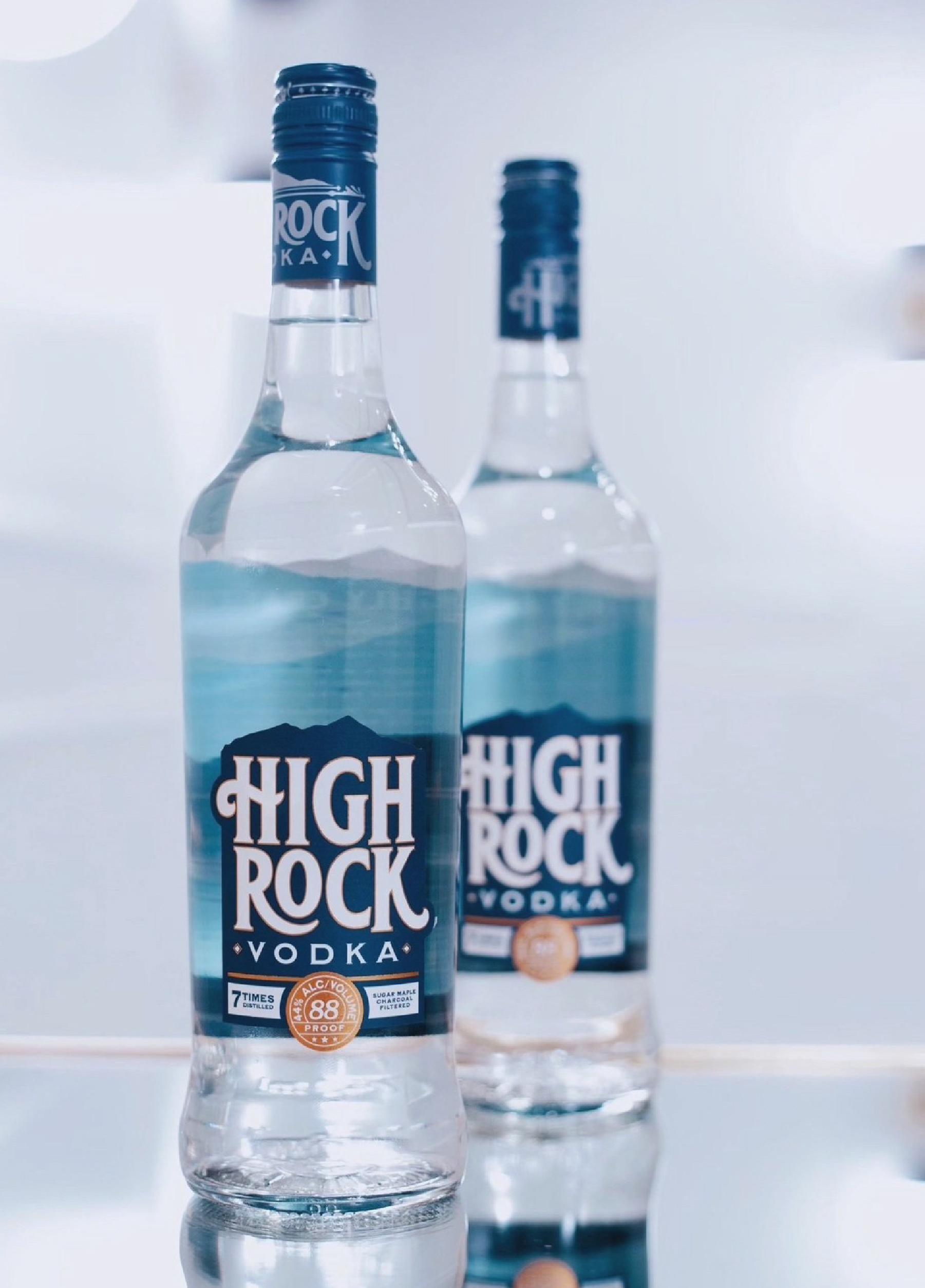
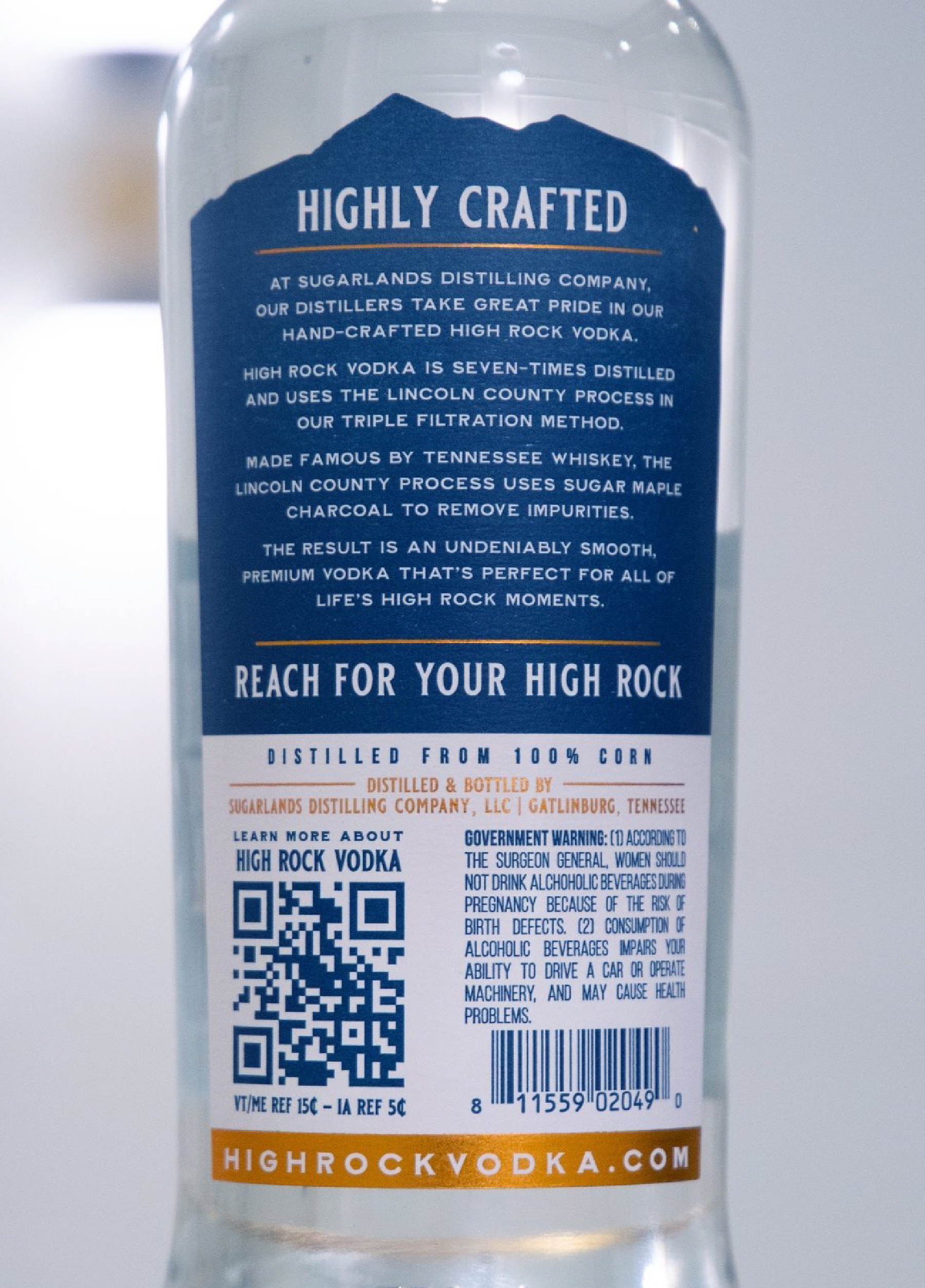
When Dale approached Sugarlands and Rare to develop the brand and the packaging for High Rock, we wanted to make sure that everything about his product would stand out on the shelves. I had the idea of creating a dual-purpose label that showcased the beauty of the Smoky Mountains, while also displaying the purity of the vodka. I wanted the viewer to be able to see the mountain view through the bottle, while the High Rock identity shines on the front of the bottle. We also wanted to honor Dale's family racing heritage by including subtle references on the packaging. The "88 proof" badge at the bottom of the front label is styled after the numerals that were used on his infamous #8 Budweiser car.
The RARE Design Team
Rodney Richardson - Principal/CD
Marie Siegfried - Account Director
Jason Wright - Account Manager/Copywriter
Ethan Manning - Designer
Cody Bass - Designer
Brian Bollig - Designer
Rodney Richardson - Principal/CD
Marie Siegfried - Account Director
Jason Wright - Account Manager/Copywriter
Ethan Manning - Designer
Cody Bass - Designer
Brian Bollig - Designer
Services Provided:
Identity Design
Packaging Design
Packaging Design
The Original High Rock Brand and Packaging We Were Requested to Update.
The Final Chosen High Rock Identity and Bottle Packaging.
Distilling the Details.
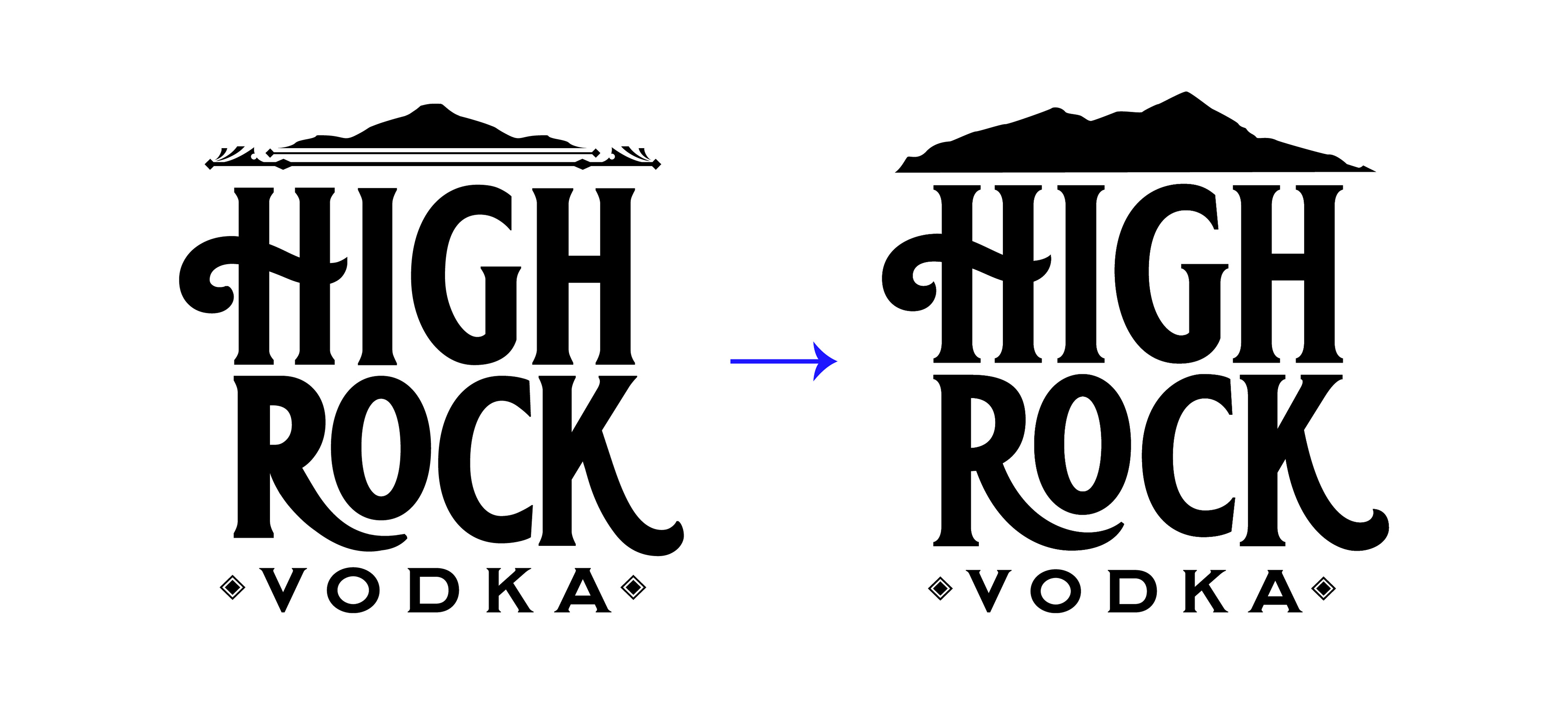
While we were working on the packaging and updated branding for the High Rock Vodka team, I wanted to take a closer look at the High Rock identity. I noticed there were some inconsistencies in the font that was originally chosen, and I decided to take a swing at creating a strong legacy-mark for the final identity system. I ended up cleaning up the swashes and refining the serifs and kerning to the mark. I wanted the identity to match the clarity and smoothness that the vodka carries.
While we were working on the packaging and updated branding for the High Rock Vodka team, I wanted to take a closer look at the High Rock identity. I noticed there were some inconsistencies in the font that was originally chosen, and I decided to take a swing at creating a strong legacy-mark for the final identity system. I ended up cleaning up the swashes and refining the serifs and kerning to the mark. I wanted the identity to match the clarity and smoothness that the vodka carries.